Hot Damn
A brand identity built from a challenging first thoughts and rethinking strategic approach.
Role Designer
Context Student project · Ferris State University
Year 2024
Award Gold student ADDY for Integrated Brand Identity Campaign
Reframing hot damn canged more than the design, it changed how I solve problems.
I learned to stay curious, challenge my assumptions, and embrace uncertainty.
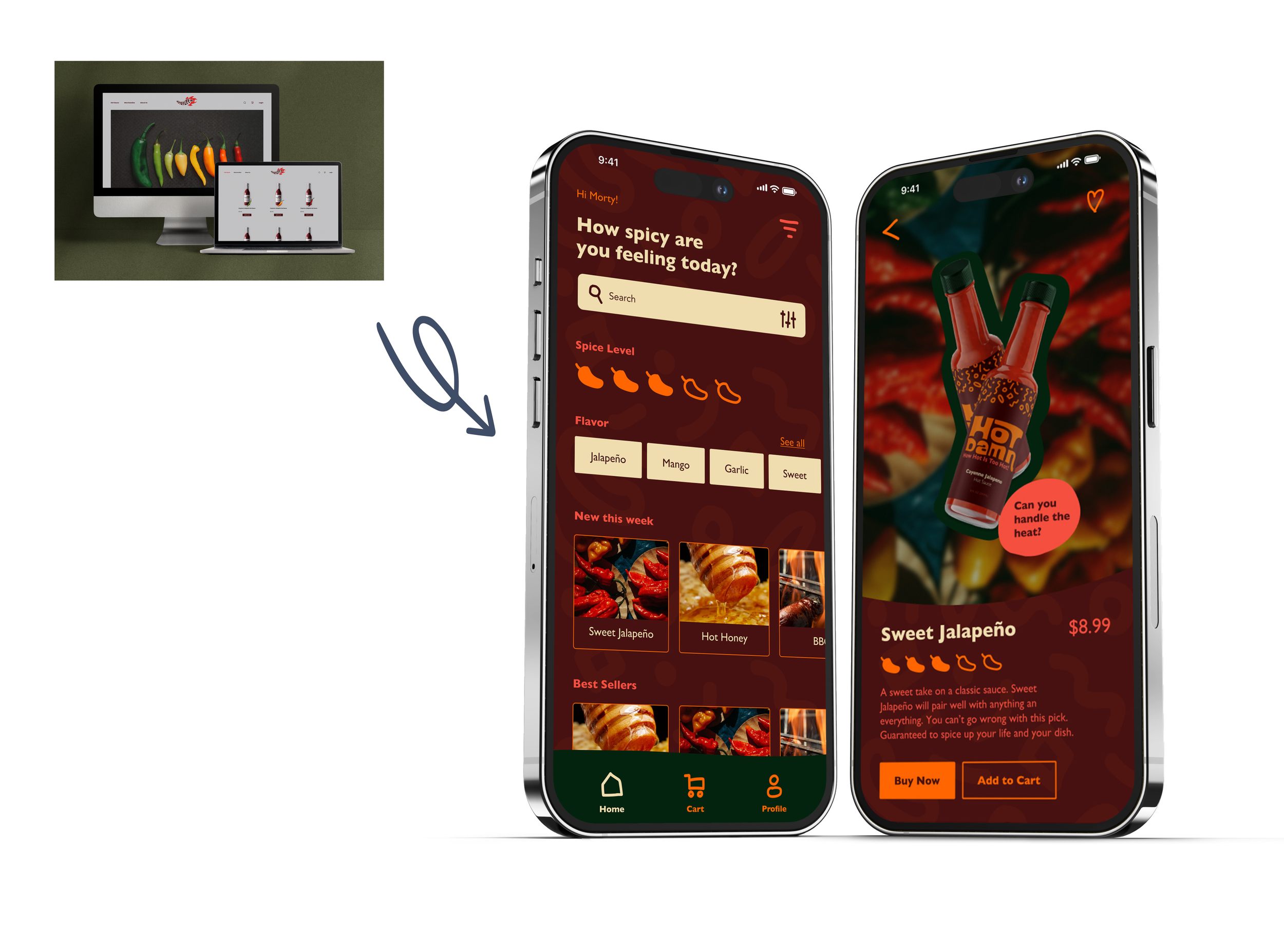
Hot Damn began as a student UX branding project, my sophomore year. My initial process leaned heavily on learning UX research and strategy, but the resulting identity didn't capture the experience I was discovering within my research.
When I revisited the project years later, I approached it differently. Rather than letting the my initial conclusion drive my secondary approach, I separated the strategic problem from the creative one and rebuilt the identity from the ground up.
Understanding the audience
What I started with
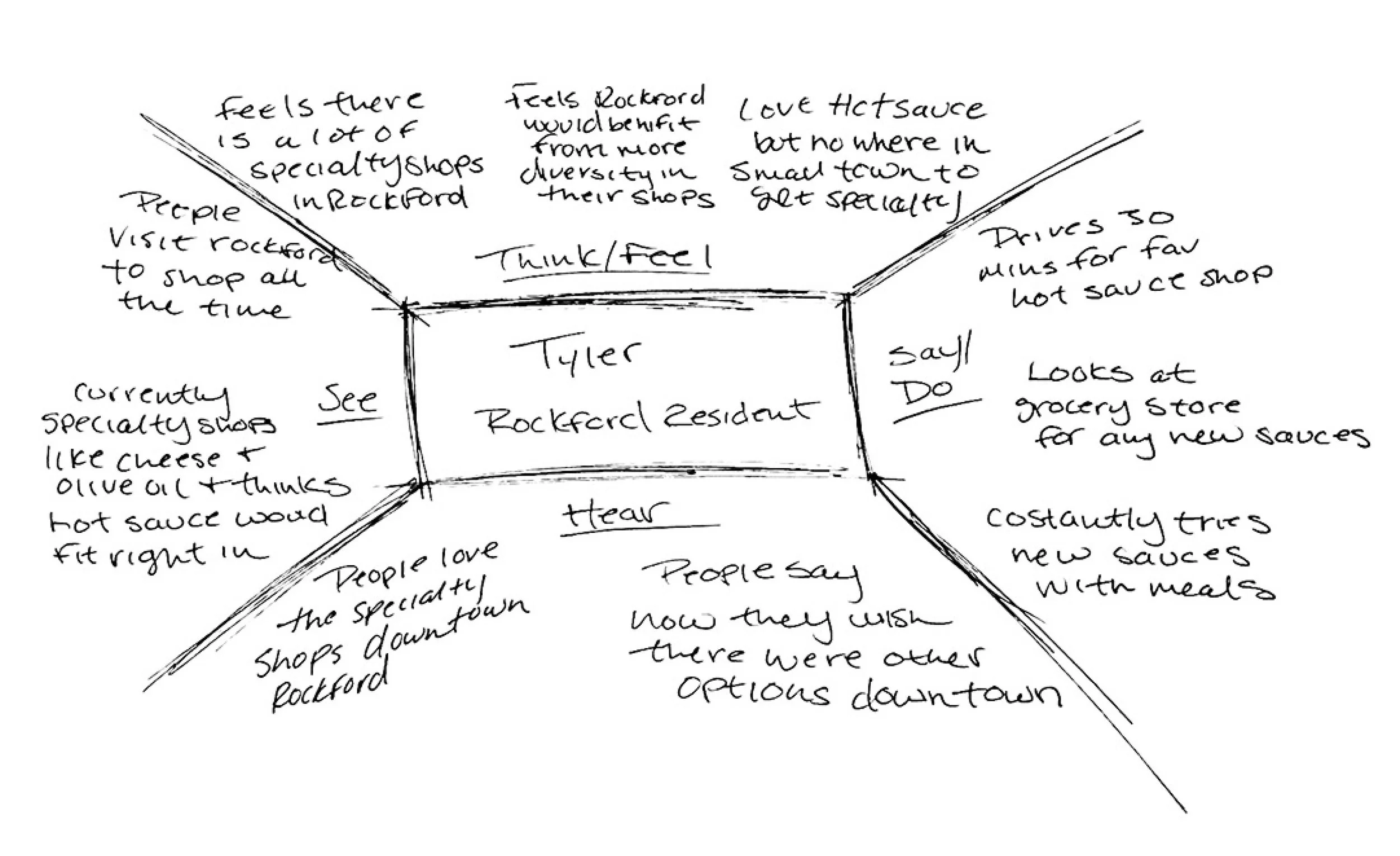
I began the project by using very basic UXR methods to better understand the audience, their expectations, and what the brand needed to communicate. The research helped establish a direction, but it quickly became clear that understanding the audience was only part of the challenge.
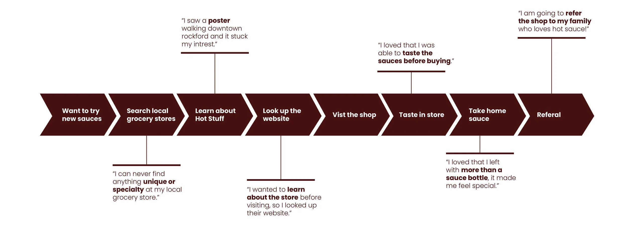
Audience: A playful, social-minded audience looking for something approachable, memorable, and worth sharing.
Perception: The initial concept communicated the idea, but lacked the personality and distinctiveness the brand needed.
Opportunity: Build a brand that feels bold and recognizable while giving it a flexible visual system to grow.
What this means and how I translated it
The strategic action plan I developed next
The research gave me a clearer understanding of who the brand needed to speak to and how it needed to feel. I used those insights as a foundation, then translated them into a visual system that could carry that personality consistently across the brand.
Capture attention
I needed to create an immediate visual impact for an audience that responded to bold, direct communication, so I built a high-contrast visual direction designed to stand out and leave a lasting impression.
Build personality
The brand needed to feel energetic and approachable rather than overly polished or corporate, so I developed expressive typography and graphic elements that gave the identity a more distinctive personality.
Create recognition
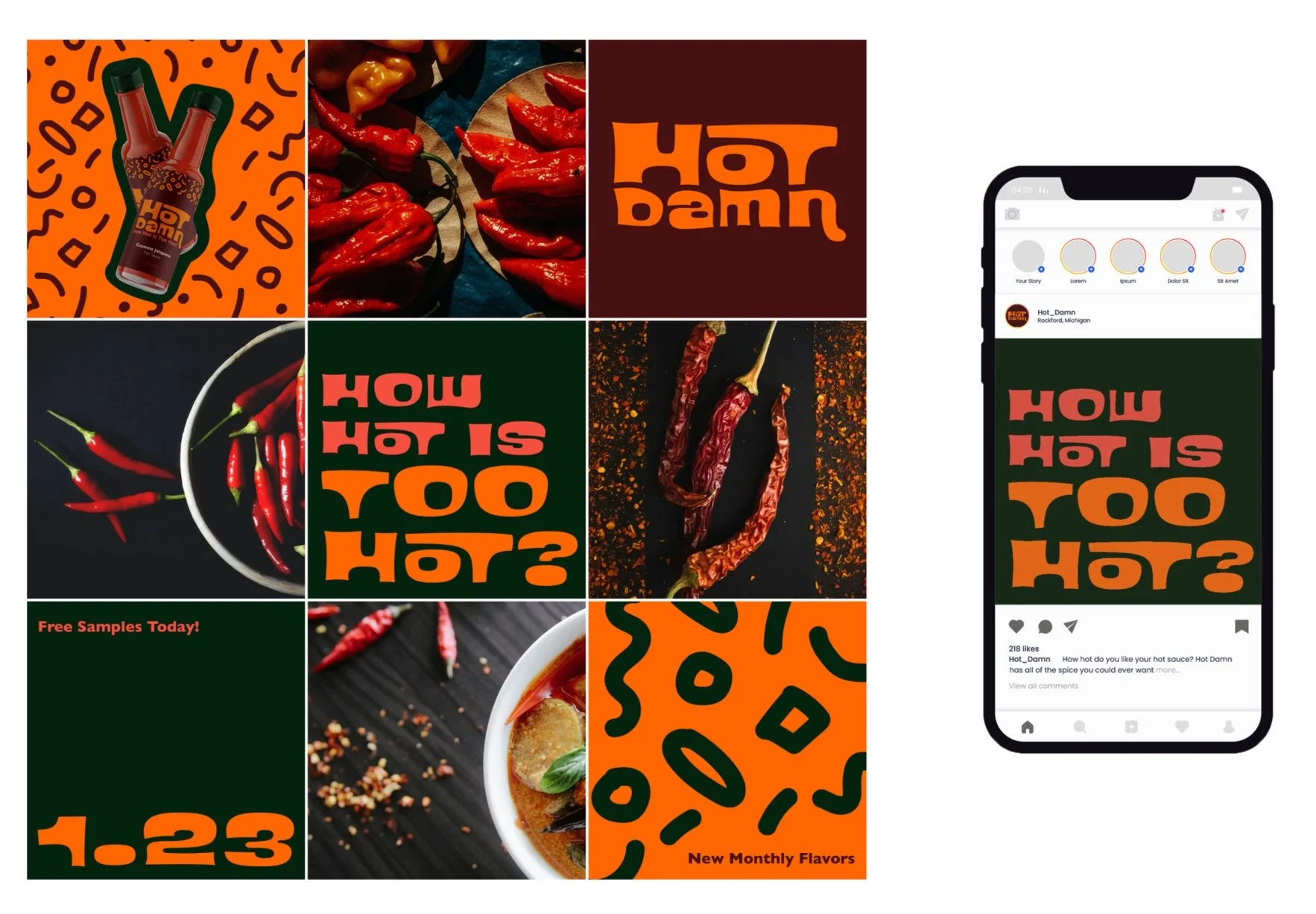
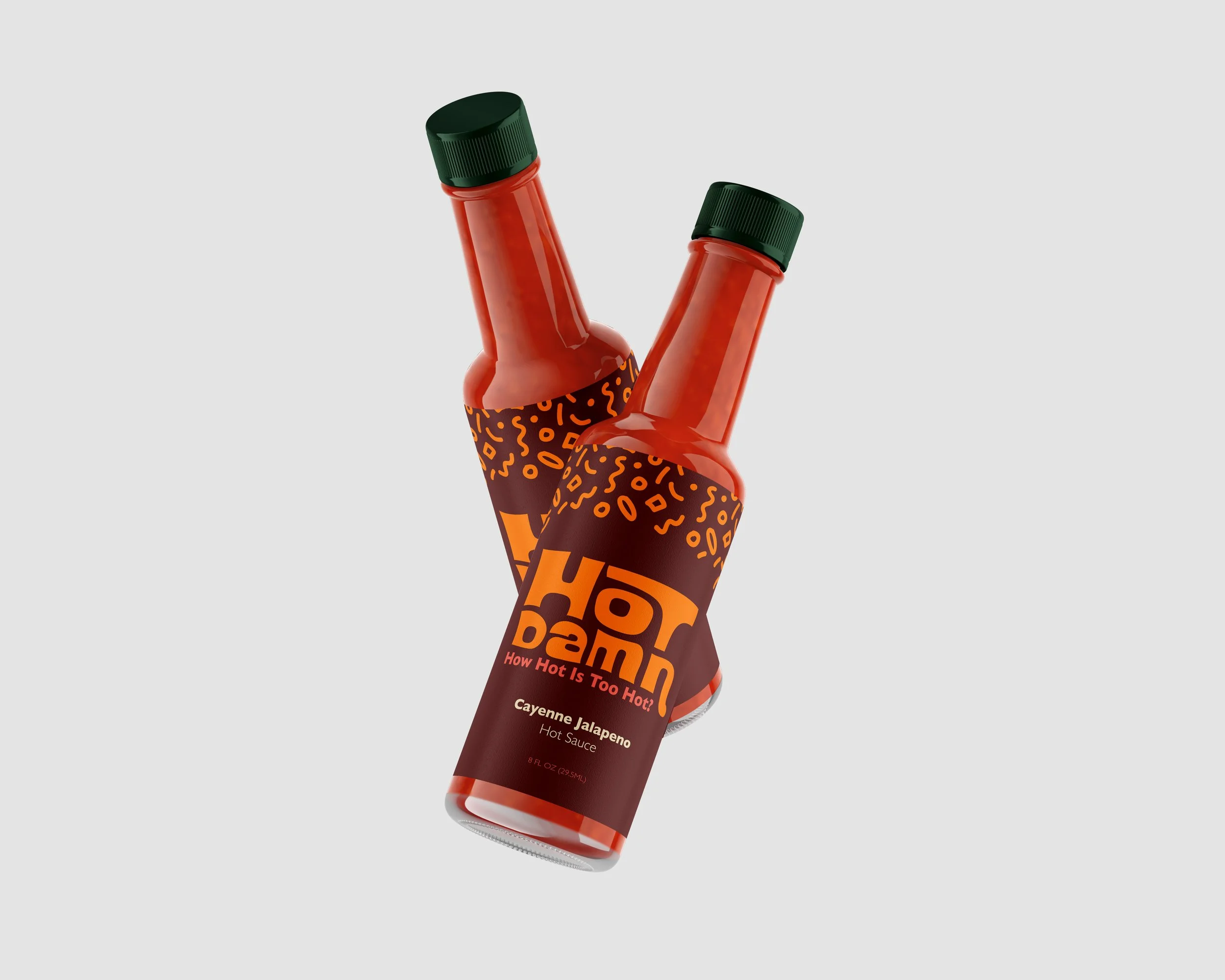
To make the brand recognizable beyond its logo, I developed recurring colors, shapes, patterns, and illustration styles that could work together as a consistent visual language.
Design for flexibility
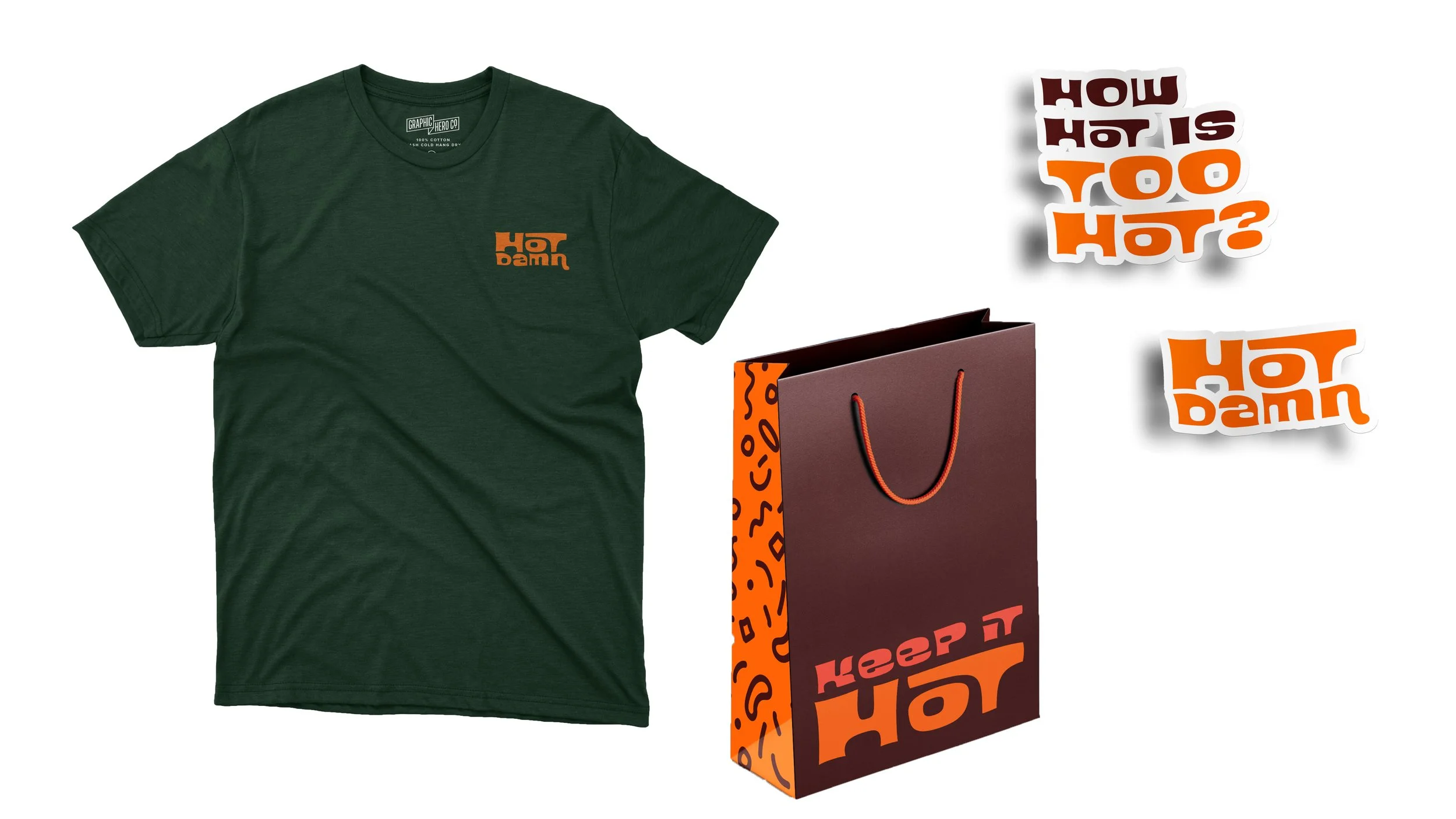
The identity needed to work across very different touchpoints, so I built a system that could scale from packaging and environmental graphics to social and digital experiences without losing its personality.
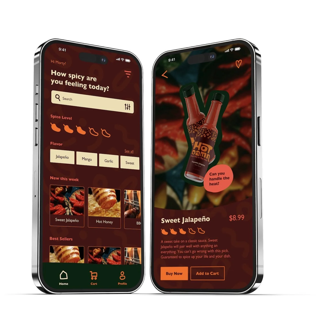
Carry the identity into digital
Because the brand would extend beyond physical applications, I translated the visual language into digital layouts and interactions while maintaining the same tone and visual recognition.
Make the system feel cohesive
I tested the visual language across applications and refined how the individual elements worked together so the brand felt consistent without becoming repetitive.
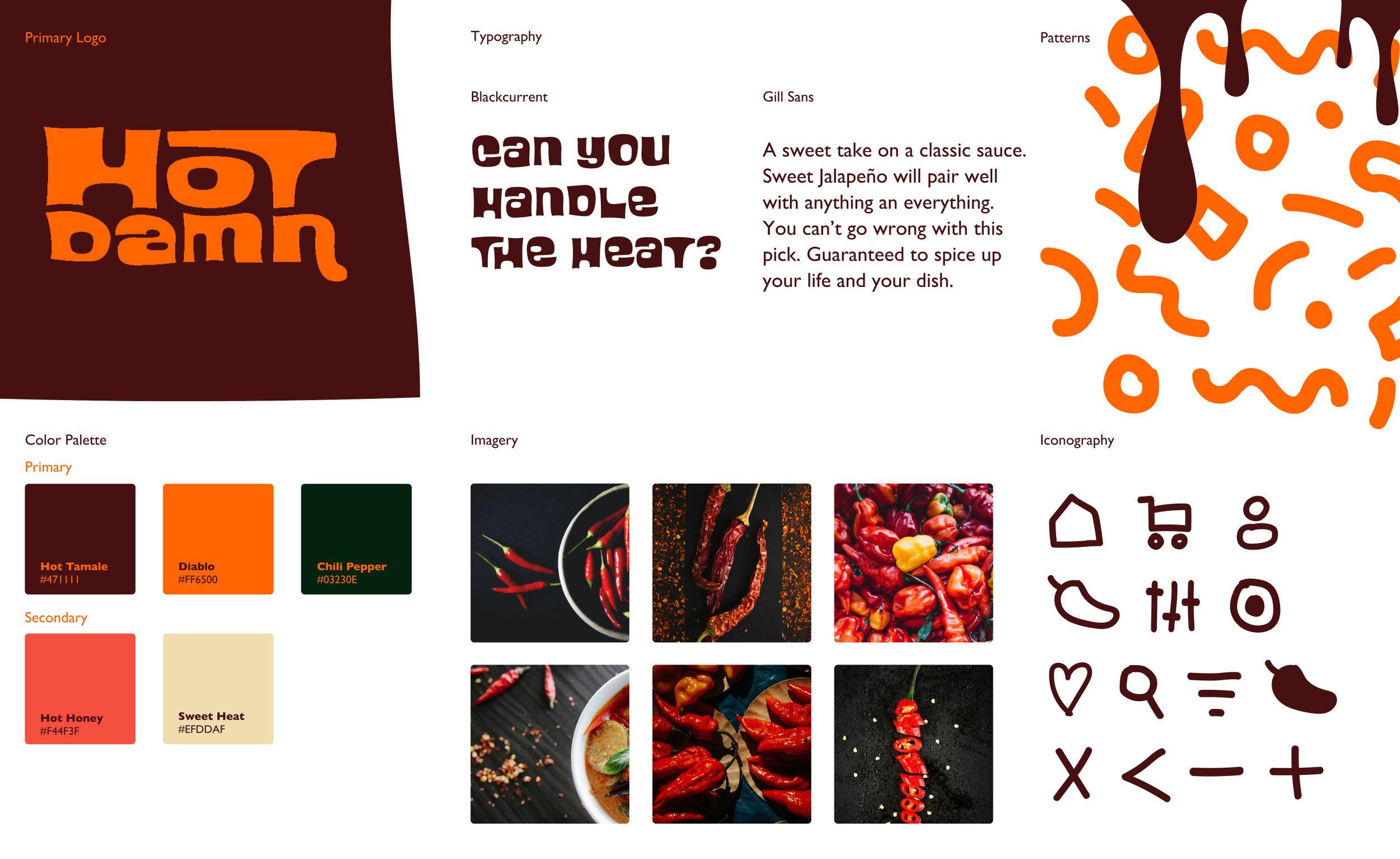
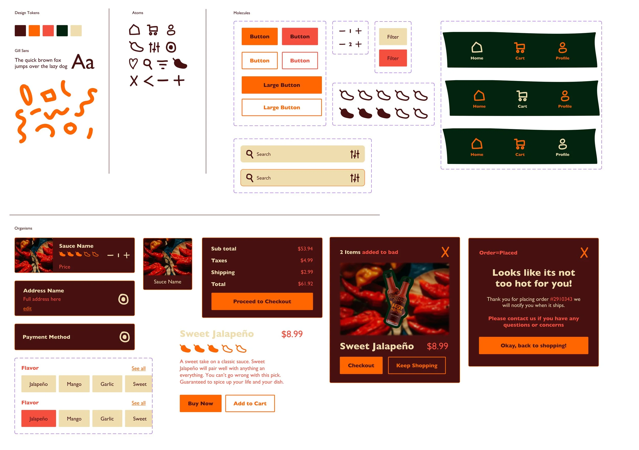
building a system with a point of view.
The research showed me that this audience needed bold, direct communication to capture attention and create a lasting impression.
I translated that insight into a flexible visual language, using expressive type, color, and design elements to build a recognizable identity that could adapt across every touchpoint.
Built with intention.
The system translated the audience insights into deliberate choices around boldness, personality, recognition, and flexibility. Every element. From typography and color to graphics and imagery, this was designed to work together as one cohesive visual language.

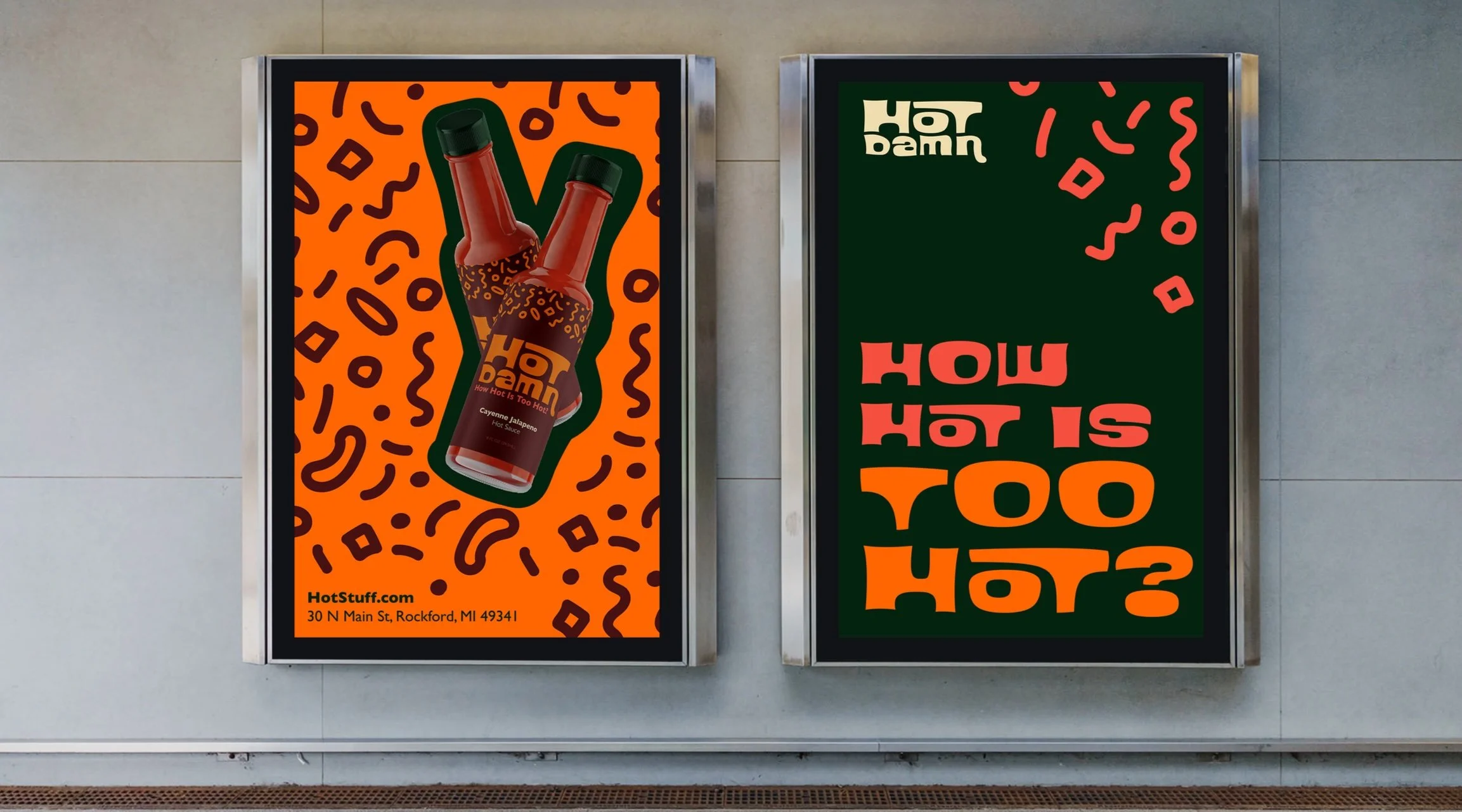
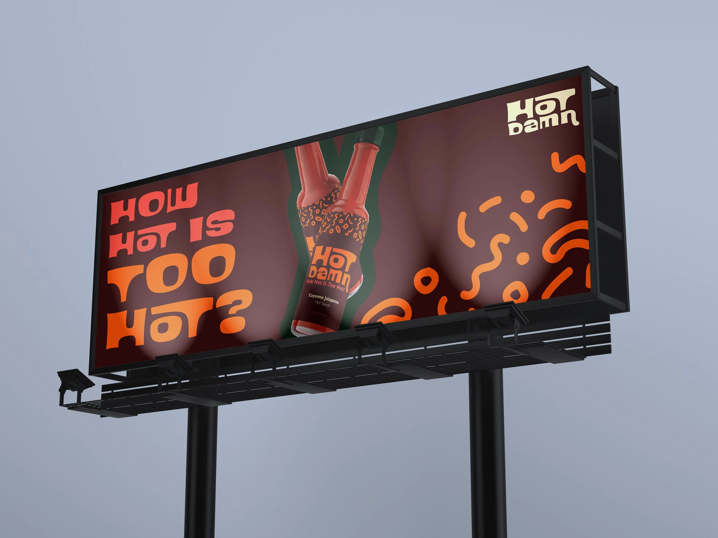
Designed to go everywhere.
That visual language was built to adapt across packaging, print, environmental, social, and digital experiences while maintaining a consistent identity. The result was a flexible, recognizable brand system that ultimately earned a 2024 Gold ADDY for Integrated Brand Identity Campaign.